Google Election 2007
Looking swell, but what wrong with this picture?
Two posts ago, I had AEC Electoral Divisions in Google Earth - Part I. It linked six Google Earth Maps that showed the electoral divisions for all the territories and four of the six states. They weren't very flash - all they showed were the boundaries, plus a little bit of metadata. Still, I was a little proud. I had generated and tweaked them from the Australian Electoral Commission mapping data myself. It was my first post in six months. I even planned on a sequel - linking the equivalents for Victoria and NSW. To my dismay, I've been trumped by Google itself. Witness their Australian Federal Election 2007 site yourself, view their maps on your Browser, or even download it onto your Google Earth desktop.
My reactions were mixed when I learned about it on Friday - dismay and annoyance at my efforts superseded, yet admiration for their product, plus relief in that I didn't have to add the extra maps, yet a niggling feeling that I should provide them for completeness anyway. I haven't made up my mind, but I doubt there will be no AEC Google Earth Part II post from me.
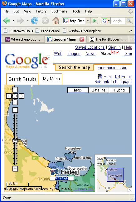
I'll start with the strengths of Google's Federal Election maps, and there are many. Party allegiance is shown by colour coding; they're more colourful than my maps. In addition, users can learn seat information and candidate lists from clicking on the icons. Using the map above, what can a user learn?
The seat in yellow is Kennedy, held by independent Bob Katter with a margin of 18.8%. That's very safe. On the right in green is Dawson, held by National De-Anne Kelly with a margin of 10%. That's safe. In the middle in blue is Herbert, with Liberal Peter Lindsay holding it by 6.2%. That's safe-ish... well, not that safe, considering how hopeless the Liberals are doing at the moment. I actually had to drag to the left and right a little to extract most of this information, but still, the maps are wonderful.
Unfortunately, there are problems with precision. Google sometimes isn't that certain as to where electoral boundaries stop. Take a look at the map again. See the island in white? That's Palm Island, an Aboriginal reserve. According to the AEC, it's clearly part of Herbert. By its lack of colouring, Google evidently considers it terra nullius - no voters, and hence no electoral district covering it. And what an unhappy history that island has had - originally used as a penal reserve for indigenous Australians, high unemployment, low life expectancy, a recent death in custody and ensuing riots. Having the whole island disenfranchised by Google doesn't help either.
I put the omission down to cluelessness or laziness, rather than maelevolence or racism. They've done the same mistake with Rottnest island (which should be part of Fremantle). Still, this leads up to my next problem - where do I go to get these mistakes corrected? There are lots of links to YouTube blather, but I do not see any clear feedback form on Google's site. Perhaps they don't care. Perhaps they should. I think the only think I can do is contact them on their Google Blog email, and leave it from there.
UPDATE: I got this in comments:
Thanks for pointing this out. It's a technical issue with the minimum specified polygon size in the KML. We've fixed it for Palm Island and Rottnest (where I spend many Uni summer holidays) should be correctly shaded soon.
Rob
Google Australia
I checked it out today. They have fixed the colours for those islands, and some islets nearby too. Good work, Google.


<< Home